Fab Fetes: Diffa 2011 Part 3
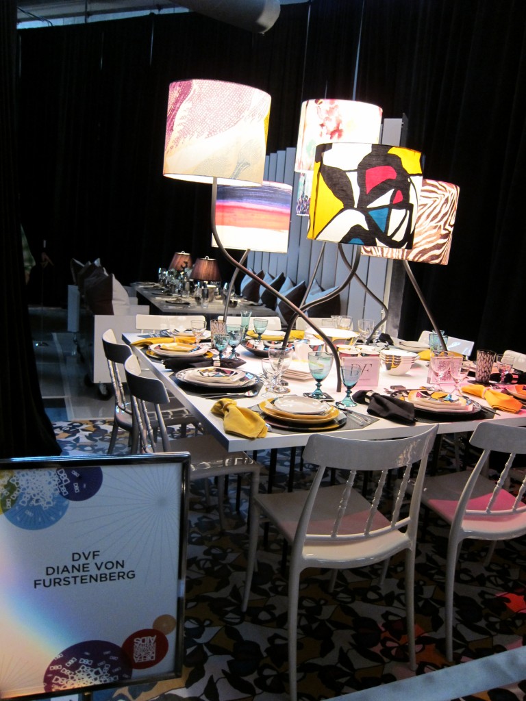
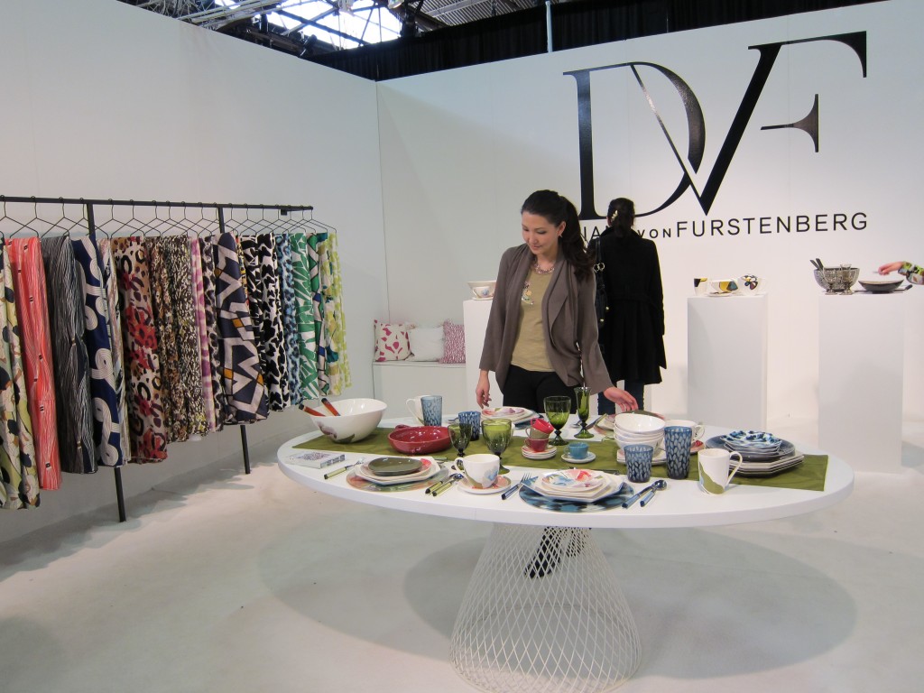
Diane, Von Furstenberg, famous for her printed wrap dresses has finally made her first foray into the home and linens category.  Joining the likes of Calvin Klein, Donna Karen and Vera Wang, she exhibits the transition from fashion to furnishings.  Here you see some of her prints on dishes, lamps, and carpet all from the Diffa 2011 NYC show.
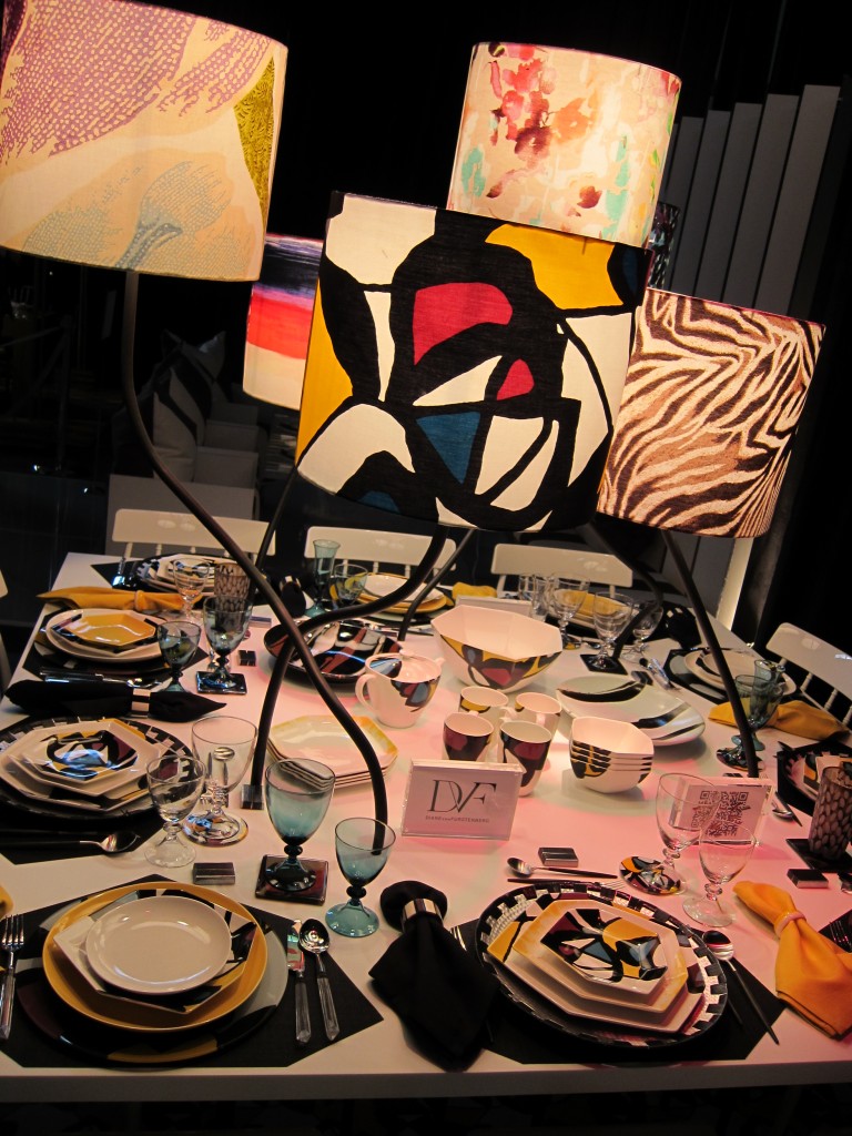
Are any of you readers DVF fans?  Does this new line excite you?  What do you think?

Designer, Tracy Reese also got involved with Diffa 2011.  See the 10’x10′ space she helped design for Effen Vodka’s sponsored area.
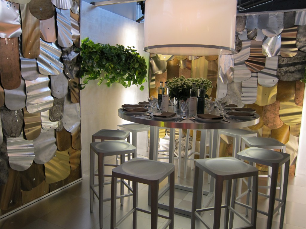
You’ll see that the walls came straight off Tracy’s last runway.
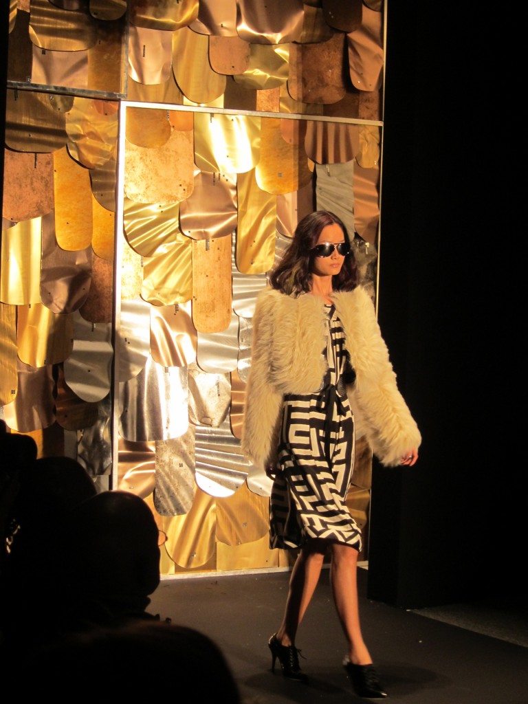
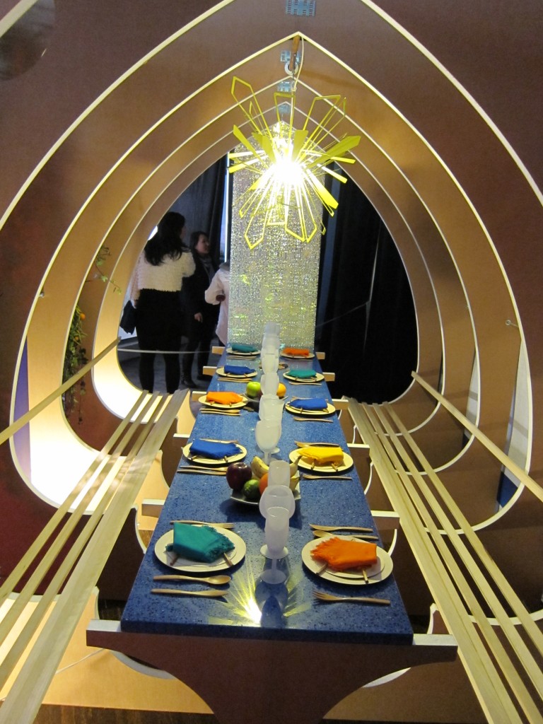
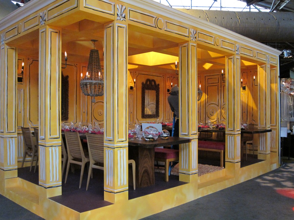
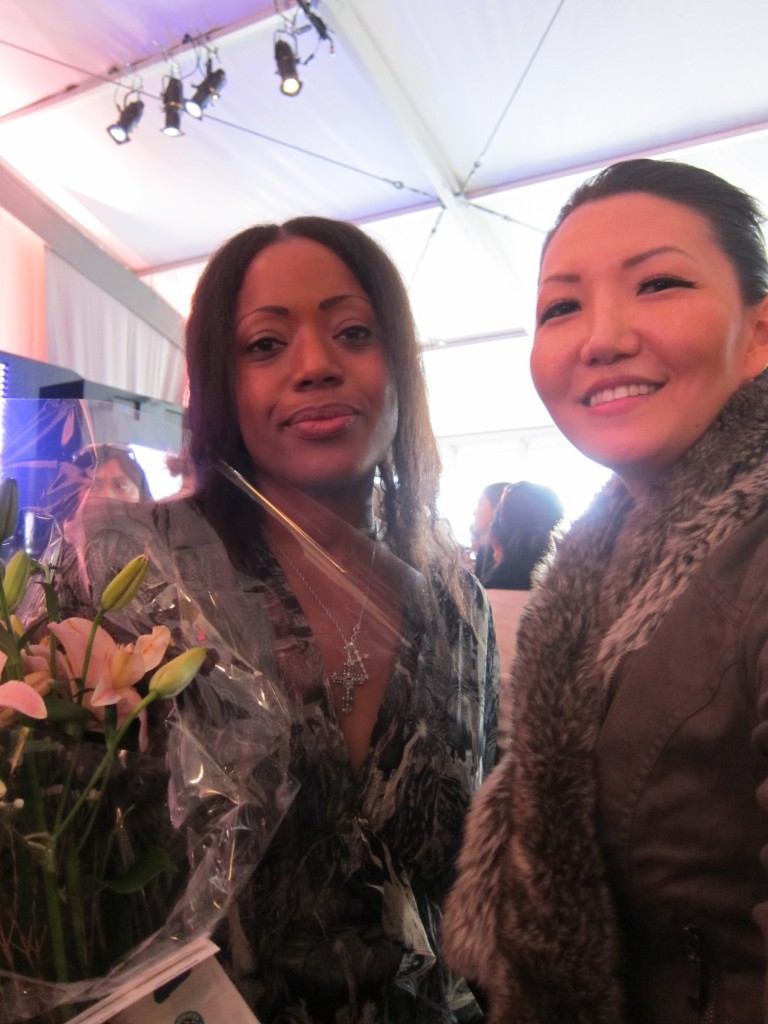
Which reminds me, I never posted my picture with Tracy from New York Fashion Week.  This is us right after her fashion show.  Love her!Here’s an architectural take on dining by design.
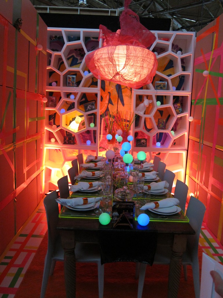
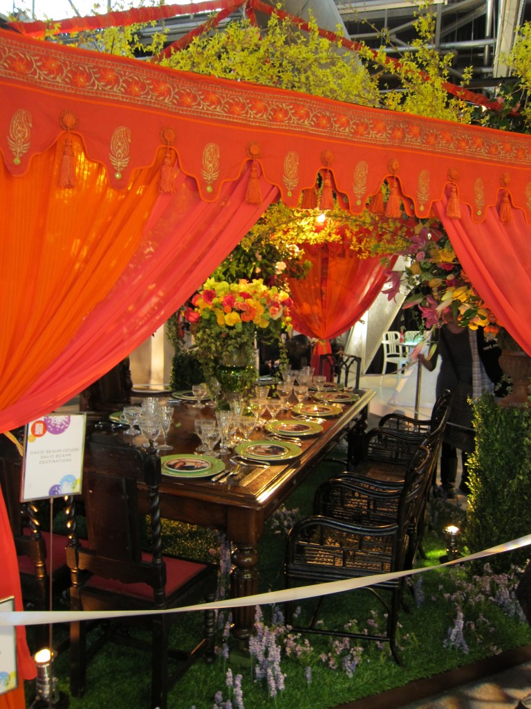
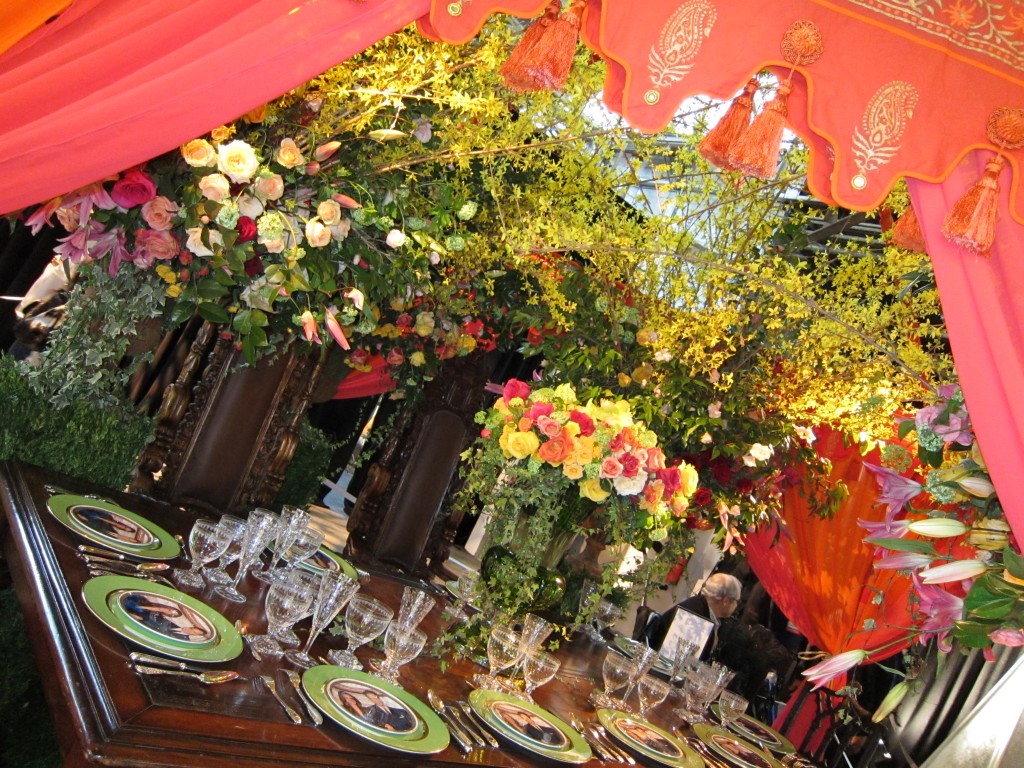
And here are a few more of my photos from Diffa 2011.

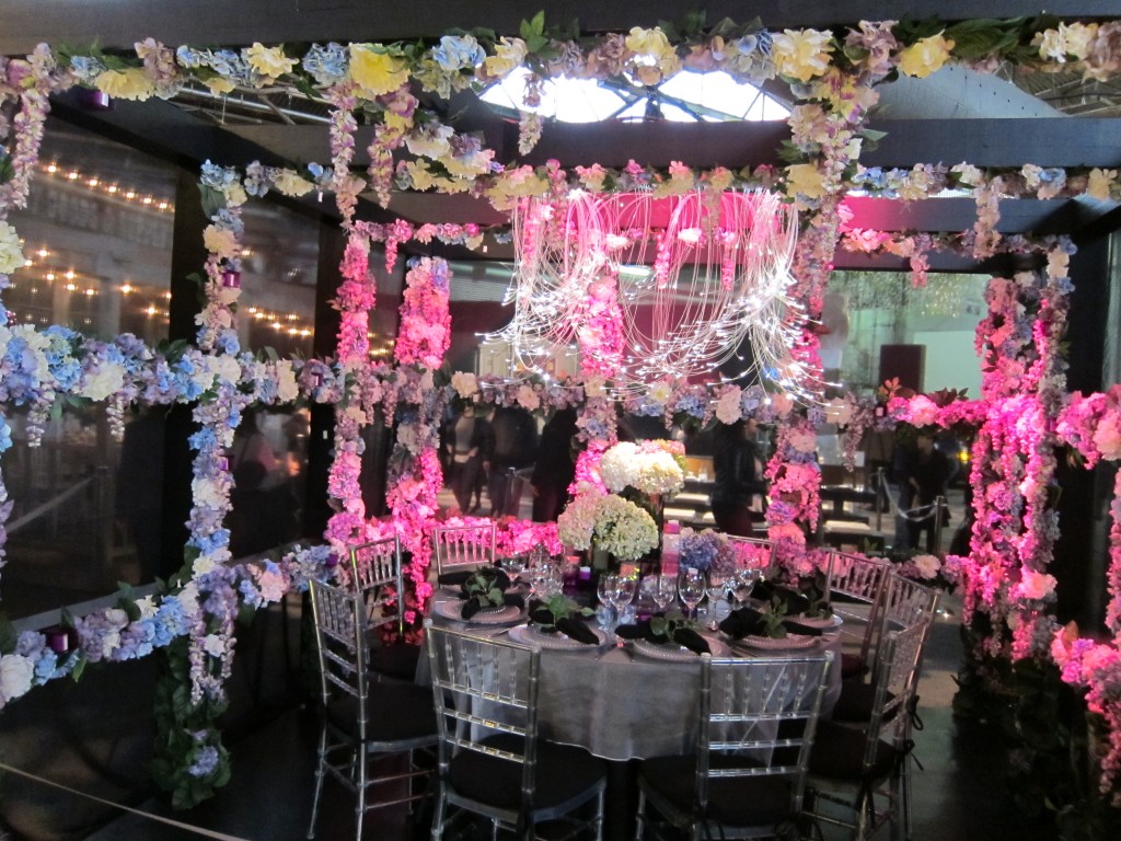
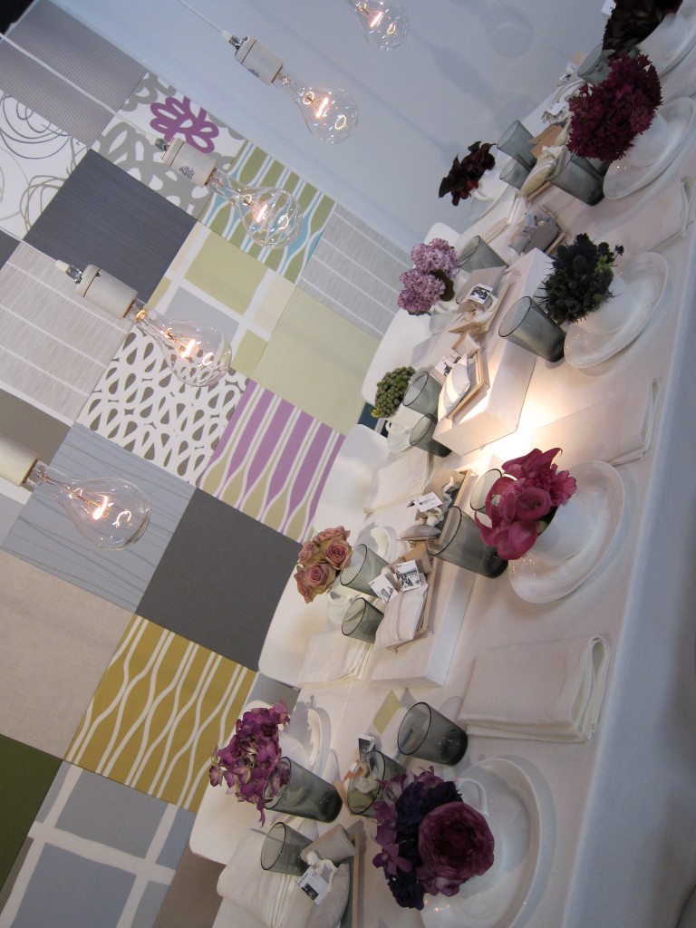
Pastel perfection.

For more on my Diffa coverage, see my previous posts!

Fab Fetes: Diffa 2011 Part 2

In my last Diffa post, I showed you how different designers created mealtime masterpieces out of the same 10’x10′ space.  I had so many photos that I had to split up the upload into 3 entries.  Here is part 2!

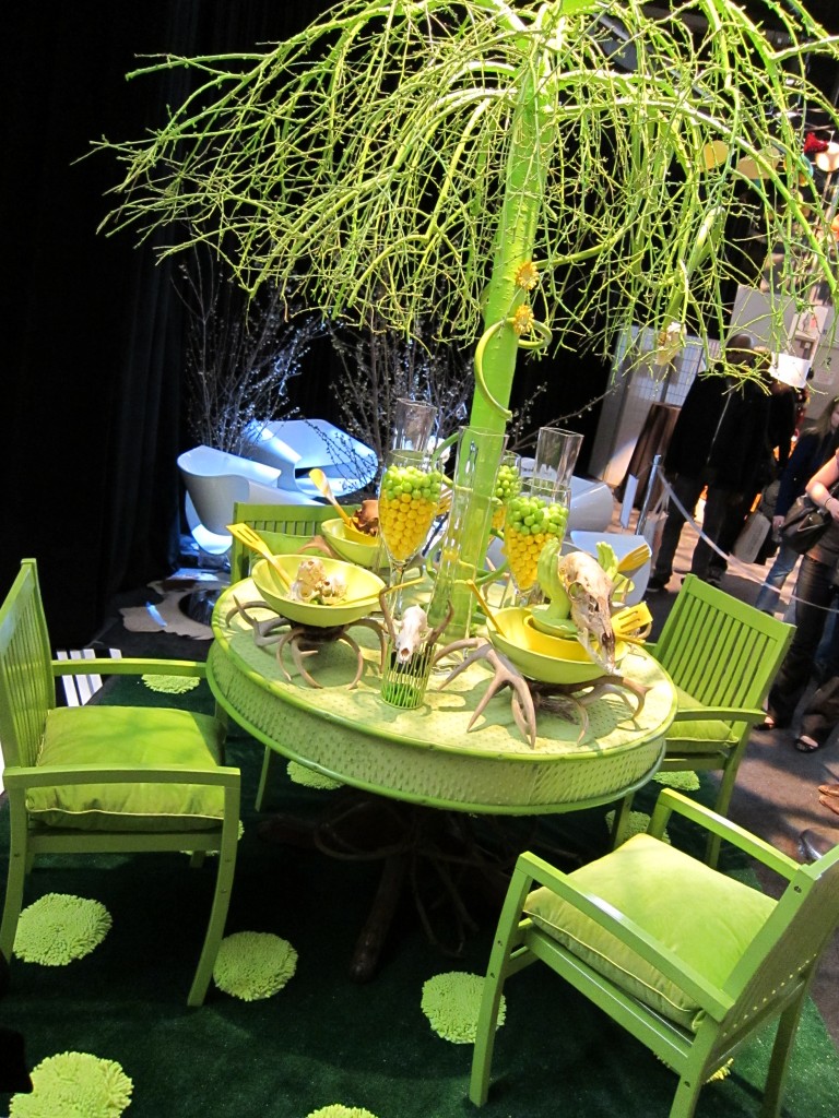
Everyone has seen tree centerpieces but what about an acid green one?  I loved the customized polka-dot rug.

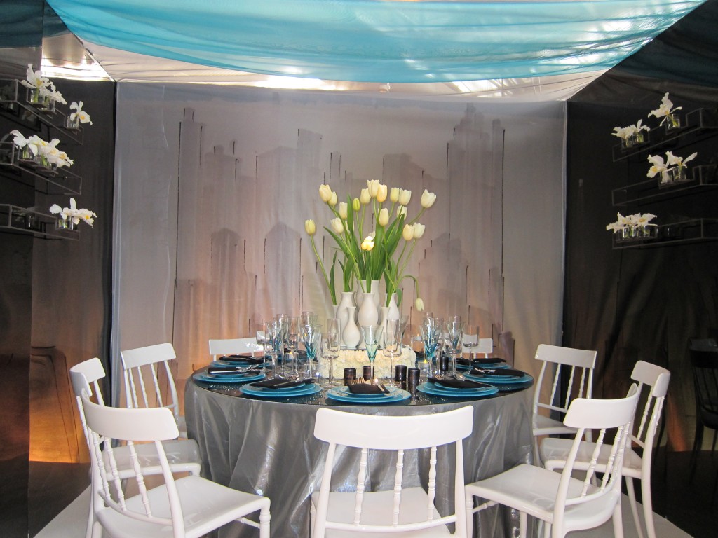
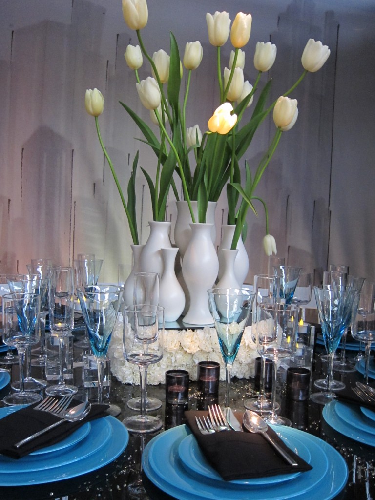
When I stopped by this booth, I was so busy looking at the tulip centerpiece sitting on top of a rose platform and noticing how the cool blue in the plates was echoed above that I didn’t notice the faux cityscape painted faintly onto the sheet backdrop.  Here’s a close-up of the centerpiece.

I found it peculiar how they deliberately untucked the spoon at each place setting.  From here on out, I made it a point to check out the variety in napkin folding and tableware placement and found that just focusing on this one detail could result in a multitude of inspirations and ideas.

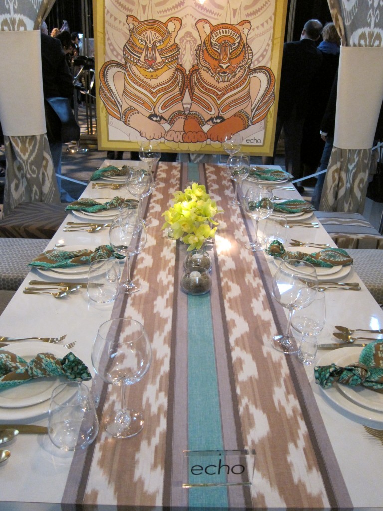
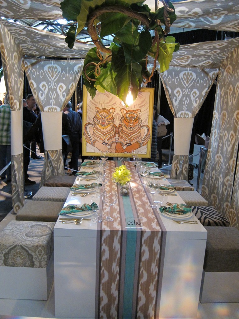
The next patterned dining area by Echo knotted their scarf – like napkins, fitting for this company.

Here is the fuller view.  What do you think?

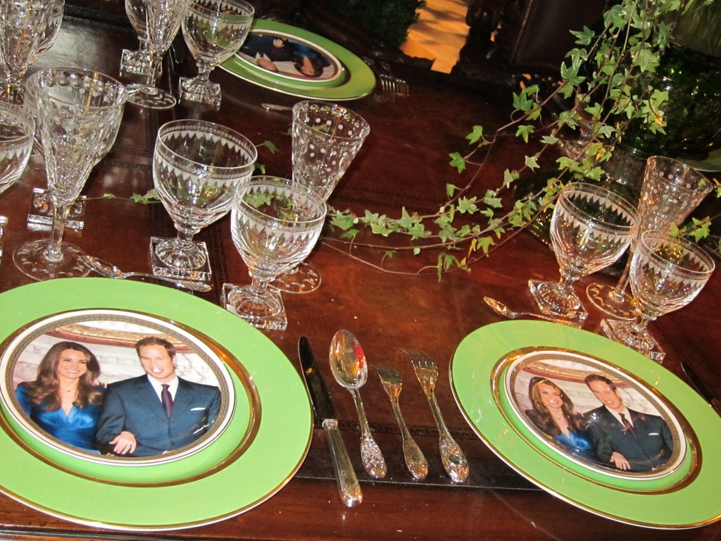
And for a royal wedding viewing party, here is the perfect dining table.  Check out the dinner plates!

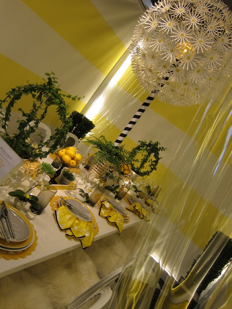
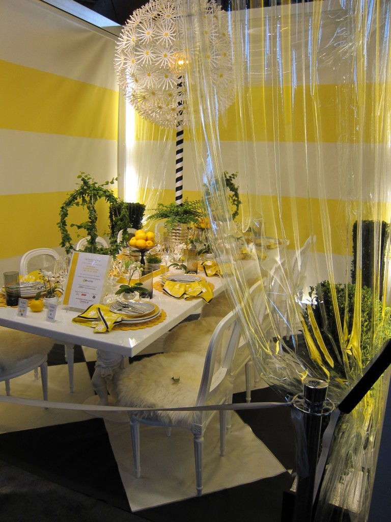
This next sunny table design featured asymmetrical linens with tableware laid across the plate.

I loved the scalloped chargers and furry seat cushions.

The video better allows you to appreciate the changing background.

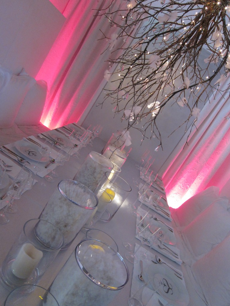
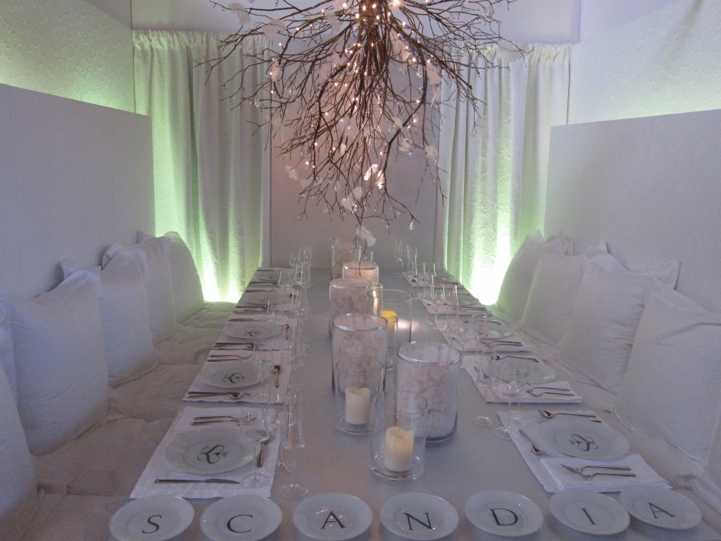
This  next pure white design reminded me of something you might find in a loungey Miami restaurant.  My favorite feature was the upside down tree branch centerpiece with white flowers.  I’ve seen attached flowers to branches but never feathers.  Unique!

Did you notice the cotton-filled clear canister centerpieces?

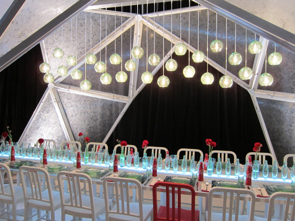
The Coke sponsored table of course featured red Coke bottles and one red chair amongst the white chairs.  It also echoed the red/white theme with red tipped napkins and bottle-like textured plates and overhead lights.  Centerpieces were clear glass Coke bottles.  Smart!

For more on the Coke concept and details from the design group, check out this video.

Which one was your favorite?

© 2024 Stylishly Stella