Fab Fetes: DIFFA
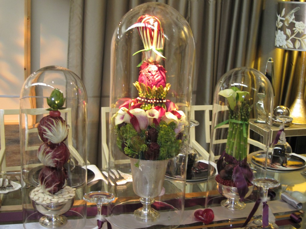
I always try to make a point of checking out the Design Industry Foundation Fighting Aids tabletop “Dining By Design” showcase. It’s one of my favorite work-related events to attend. Basically, you walk into a giant NYC Pier which is taken over by all the most fabulous florists and event planners who have oftentimes partnered with corporate sponsors and/or linen vendors to create the most magnificent tabletop displays. Think centerpieces. Think grand floral presentations. And get ready to be wowed. Here are some of my much overdue pics from my recent March visit.
I’ll start with one of my favorite displays. It was a setup sponsored by Benjamin Moore Paint. David Stark, the event planner credited for this masterpiece, took the challenge of creatively displaying paint colors to a whole new level when he concentrated on a simple, repeated motif..an egg.. an ode to the upcoming Easter holiday perhaps? Not sure but this lovely little room made me smile as I peeked through the windows and curtains.
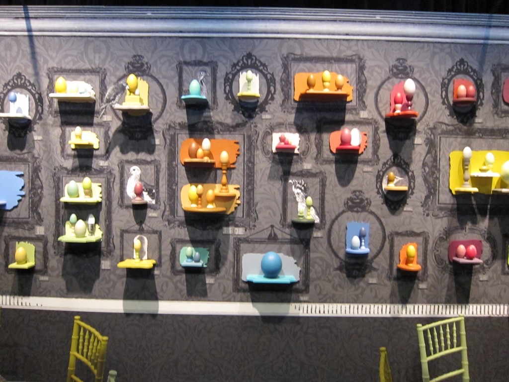
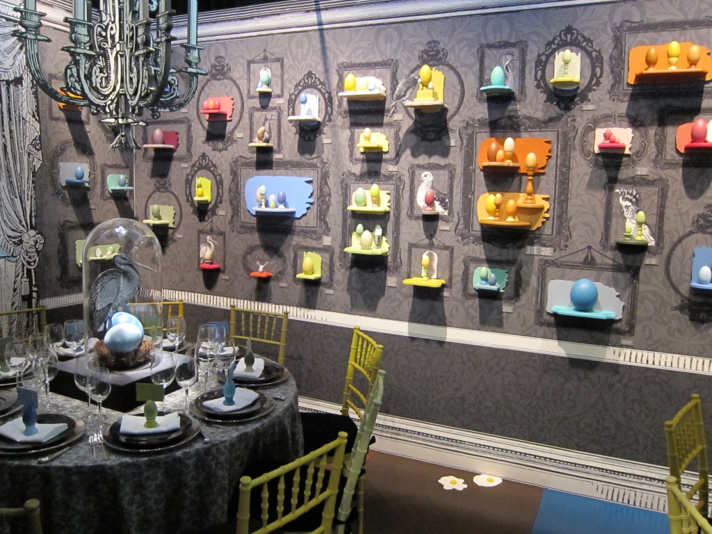 I’m a huge fan of repeated, ornate frames on walls as decor as evidenced from my previous blog posts. So I couldn’t get enough of the fun, faux frame walls. If you look closer, you’ll see that each egg represents a new Benjamin Moore color, sometimes repeated through the placecards and egg holders at each place setting.
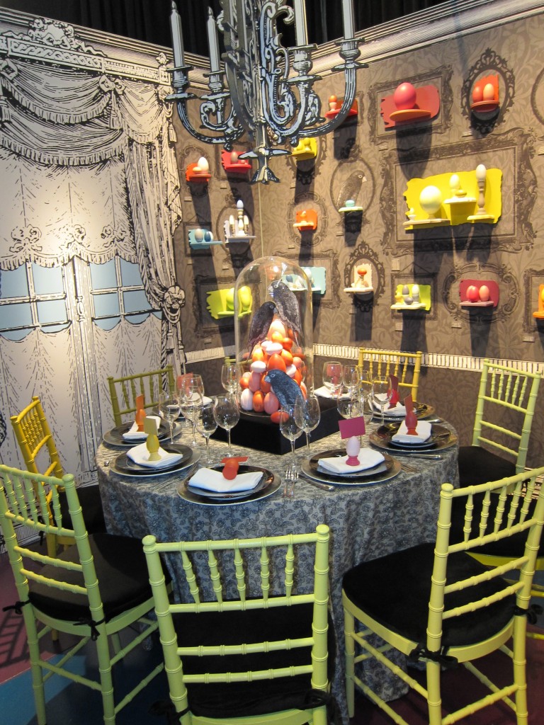 Does anyone else love the trompe d’oeil chandelier, frames, birds and window? It looks like David had a lot of fun designing this room. This room is simply EGGcellent!
 This next display looked like a cozy, fashionable restaurant booth – one that I wouldn’t mind dining at. This is by Kravet Inc.
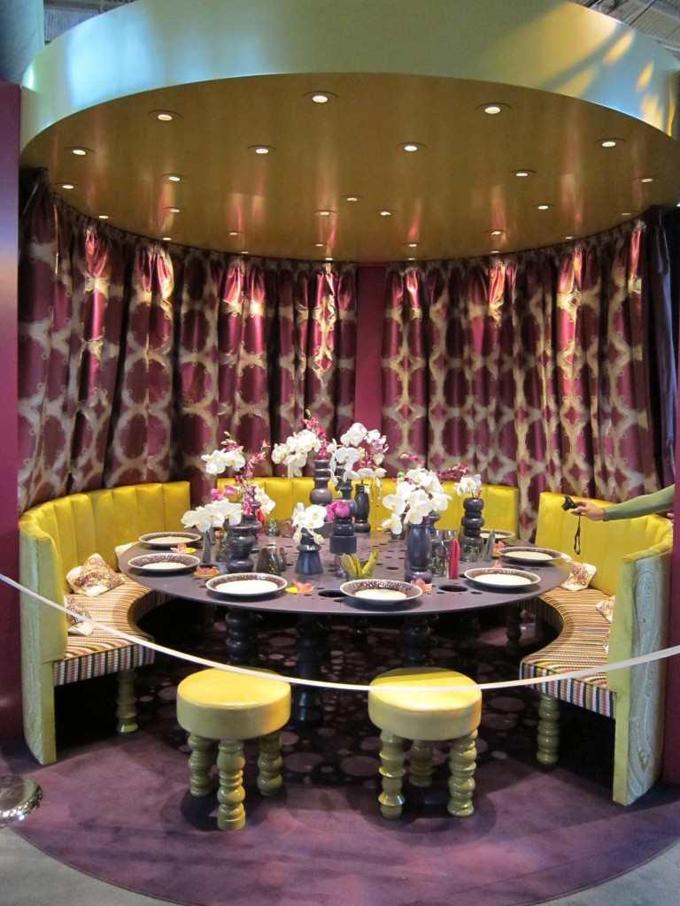 They say that purple and yellow are complimentary colors because they are opposite each other on the color wheel…er that is what I learned in my high school art class at least. I guess this picture sort of proves it. Don’t the custom linens look rich?
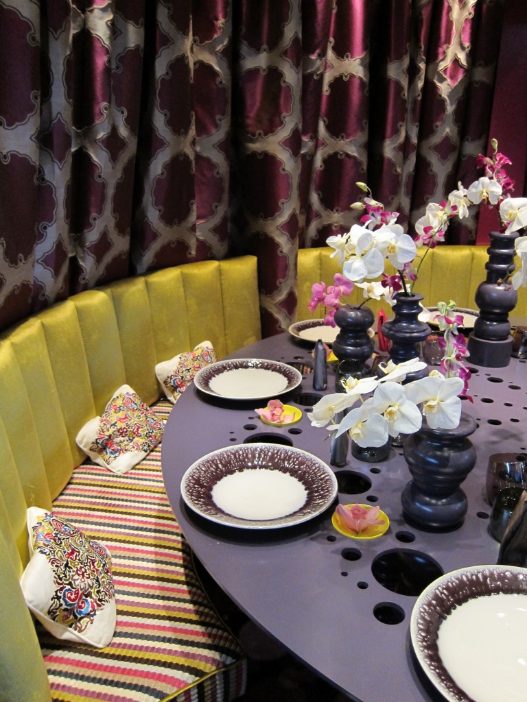 Notice the table has holes… not the most practical table but it makes for a great conversation starter I guess.
And here’s the perfect table for your next romantic Valentine’s date.
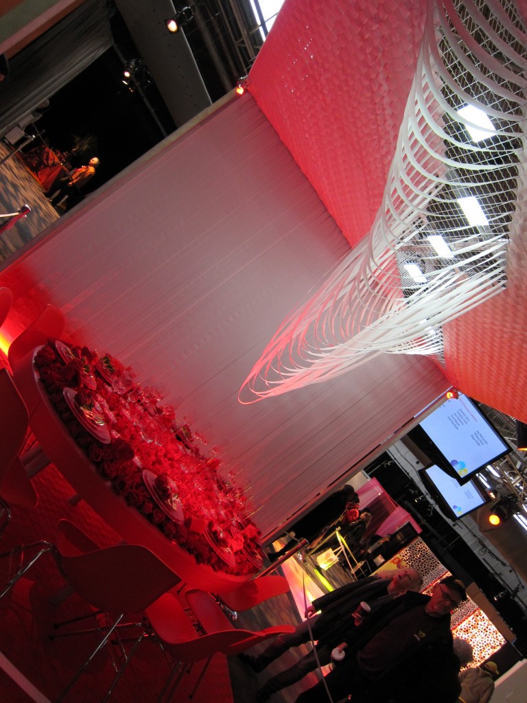
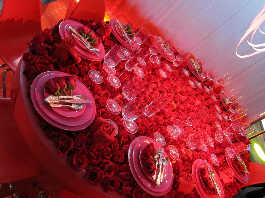 I’ve heard of a bed of roses but a table?
I once rented a water wall similar to the one shown at this next dining table. It was back in the day when I worked with David Tutera and was playing around with enormous event budgets. $15,000 for a water wall? Yea sure, why not? Ahhh those were the days…
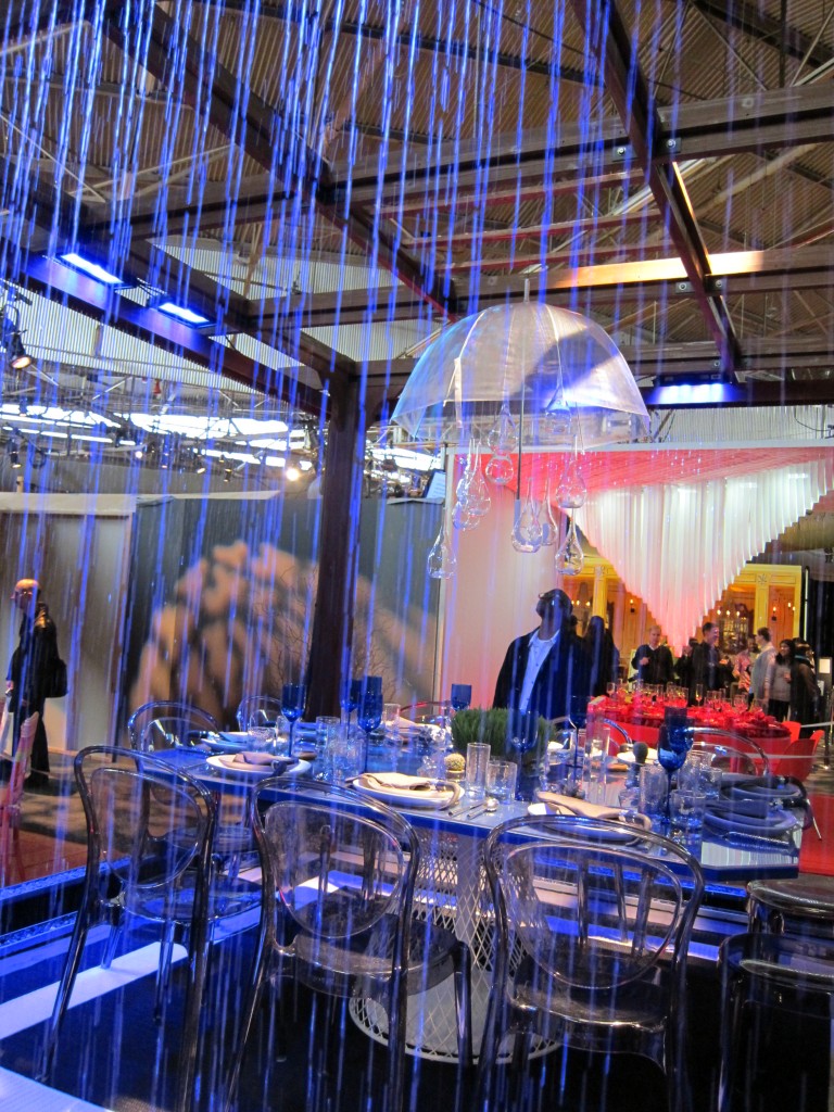 This dining area had a similar streaming effect but with ribbons – a far less expensive decor option
 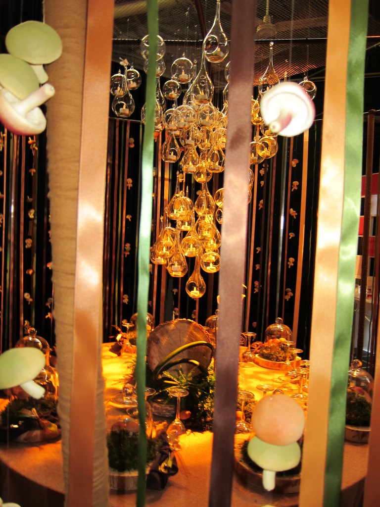 Celebrity event planner, Preston Bailey actually mentored a group from the Fashion Institute of Technology to help create this mushroom themed table.I didn’t get a close-up of the mushroom and ribbon exterior but found one on another blogger’s site. Thanks Heather Clawson from Habitually Chic
 The rest of the photos are mine shot with my Canon s90 a slr -35mm hybrid that I just love.
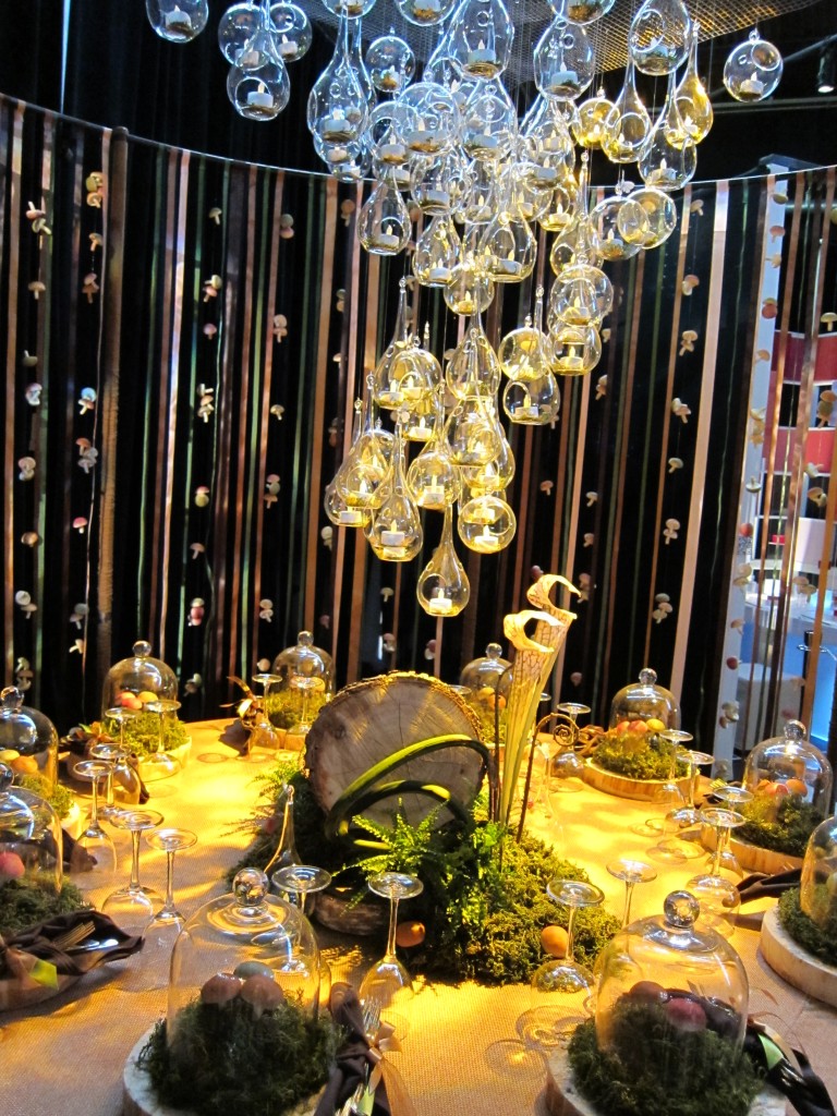 I guess everyone is eating mushrooms (and grass) for dinner. Hmmm think I’ll dine somewhere else.
Fresh and fruity is how I’d describe this next set by Todd Moore.
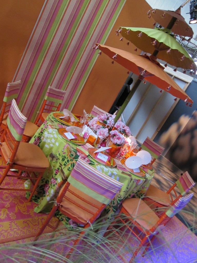 Notice the little umbrellas on each plate mimicing the umbrella centerpiece?
Modern environmentalists will love this next one. How about re-using cardboard as decor?
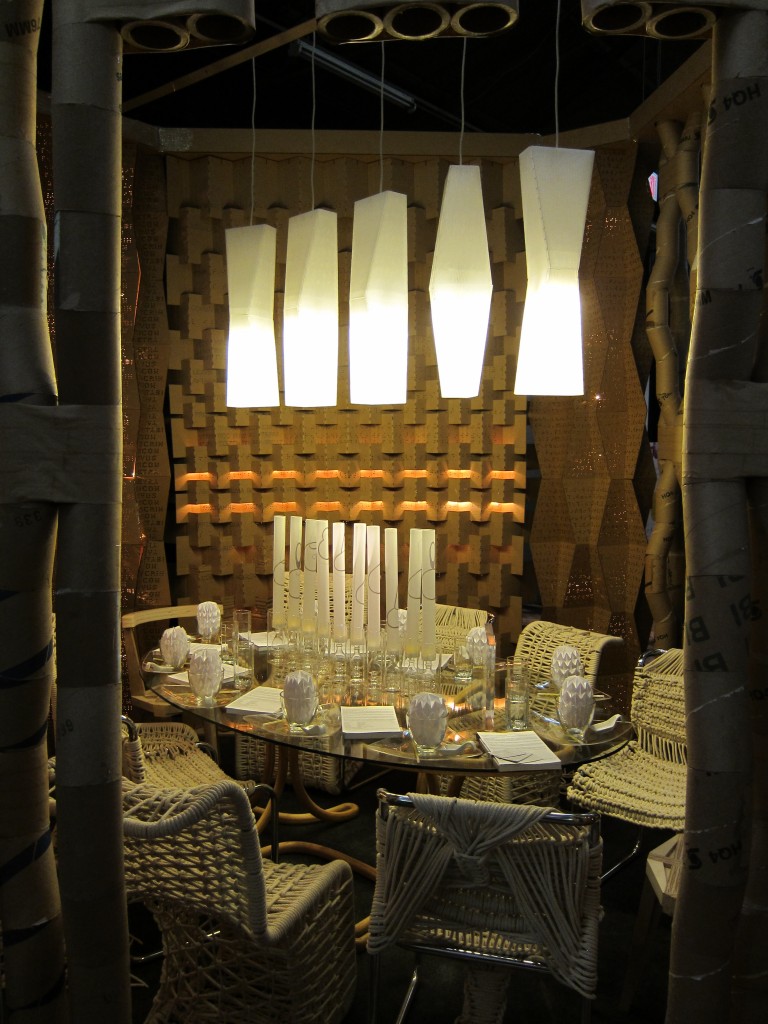 The simple color palette allows for texture to really be the star here. Let’s hope that all this cardboard goes to the recycle bin once the traveling exhibit finishes.
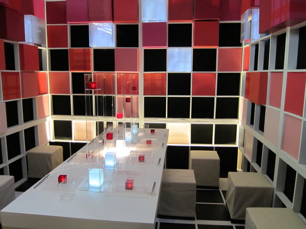
In contrast to this subdued creamy palette, this next room popped with shades of pink offering a mod/modern almost game or music video like scene. I just wished the event planner had chosen pure white ottomon cube covers rather than using those off-white canvas slipcovers. Do you agree?
 The Terra Morehouse for Velvet Antler design is another of my favorites but I’m afraid the pictures just don’t do it enough justice. I found it to be quirky, calm and modern all at once. And I’m in love with the furry pillows. Plus if I had to vote on the most unique centerpiece this one would win!
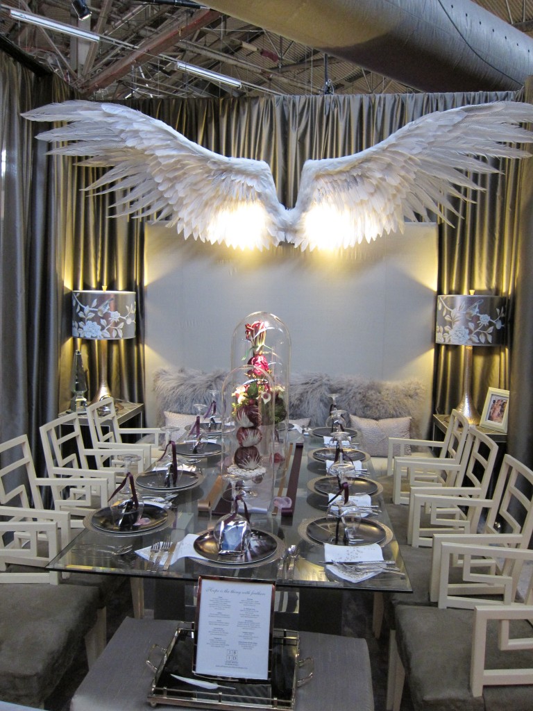
 Speaking of new and interesting centerpieces, check out this table with the frame cluster!
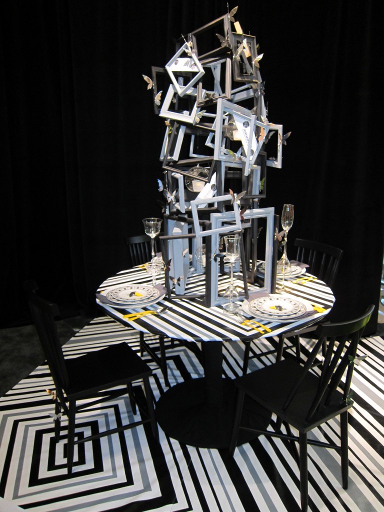
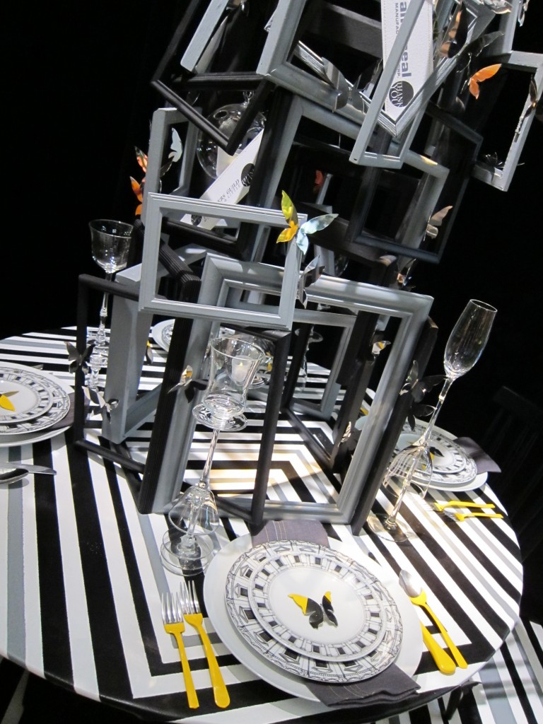 Can you see how the silverware and butterflies both look like they were dipped in yellow paint? What about the glasses stacked on top of each other? Quirky details like this throughout the day amde the close-up all that much more rewarding!
I’ll continue the pictures and post another time. For now,if you like what you saw here, check out the listed cities for this is a traveling showcase. It may be coming to a city near you!
| Kansas City | April 30-May 1, 2010 |
| Detroit | August 12-14, 2010 |
| Chicago | November 4-6, 2010 |
| San Francisco | November 17-18, 2010 |
| New York | March 17-21, 2011 |

