FabCam – New York Fashion Week
As part II to my earlier Spring 2012 New York Fashion Week fashionistas post, this post will feature fashionistas caught by my FabCam. For those of you who don’t already know, I shoot fellow fashionistas whose style I admire and take interest in. There’s no fashion bashing here. It’s all love!
Below is a lovely blonde who was wearing what looked like a vintage-styled blouse with Fall’s trendy snakeskin and the Valentino shoes that I’ve been dying for.
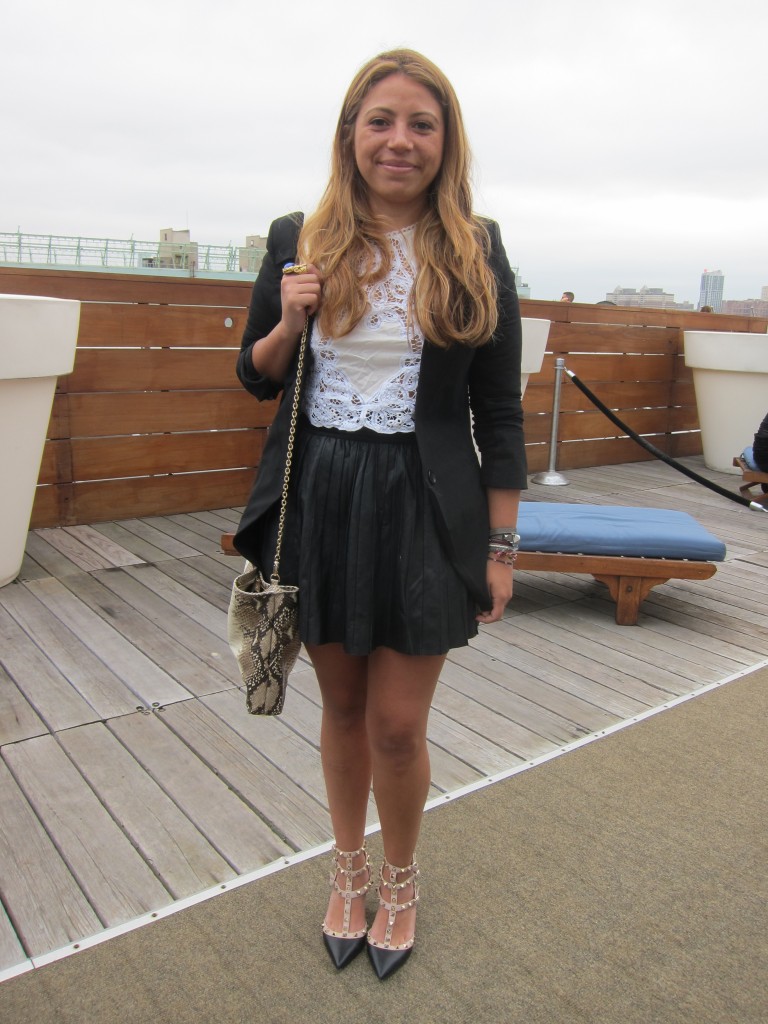
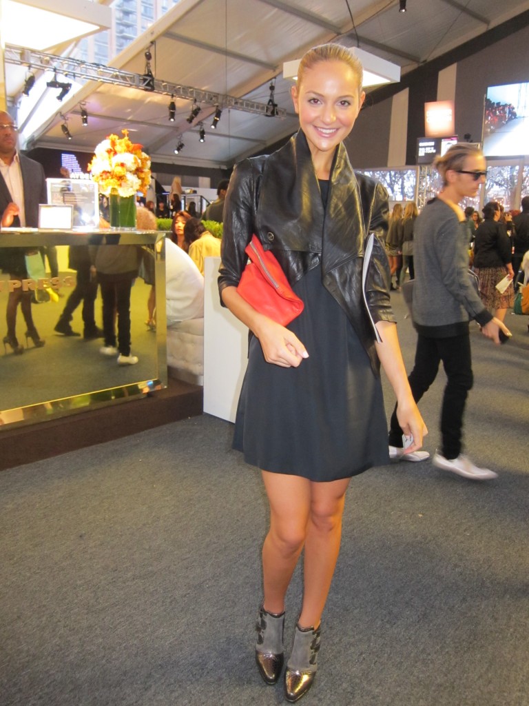 The blonde pictured above is a fellow blogger. What caught my eye about her (besides her striking beauty) was that striking leather jacket. But I love how she paired it with a swingy, simple dress, cute booties and a clutch that offered a bright pop of color.
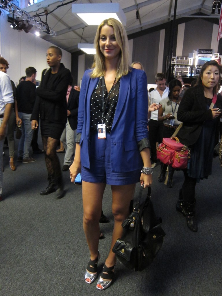 Okay, so there are a lot of blonde beauties walking the tents of New York Fashion Week. This one was a bit of a risk taker. Check out those shoes! They’re what I’d imagine an ultra-fabulous astronaut might rock. I thought her outfit was super fun in that stunning color with the polka dots peeking out – polka dots are super trendy this fall.
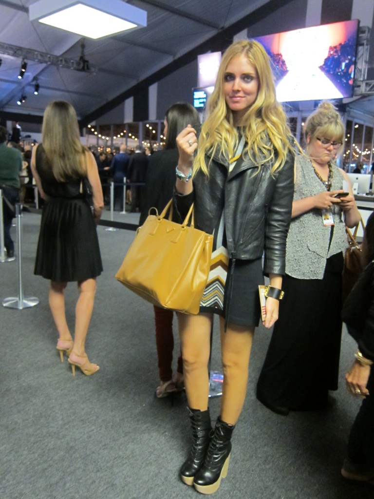 I’m looking at this one and I’m thinking, model? She certainly had the height and skinniness down and like much of whom you saw within the tents was some amazing eye candy. Don’t you love her mustard colored Prada? Mustard is a trend color this fall and this girl included it with professional ease. The little fitted jacket looks great with the printed dress (is that Missoni?) and paired with those funky boots.
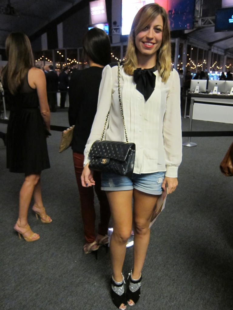 If you’re a regular reader, you know how I love Chanel purses and the black and white color theme so it’s no wonder this fashionista’s outfit caught my eye. In Rachel Zoe’s words, those booties are “ba.na.nas!” Readers, you should know that I’m up for selling my Chanel, calf-skin, chain-link purse. just click here to check it out!
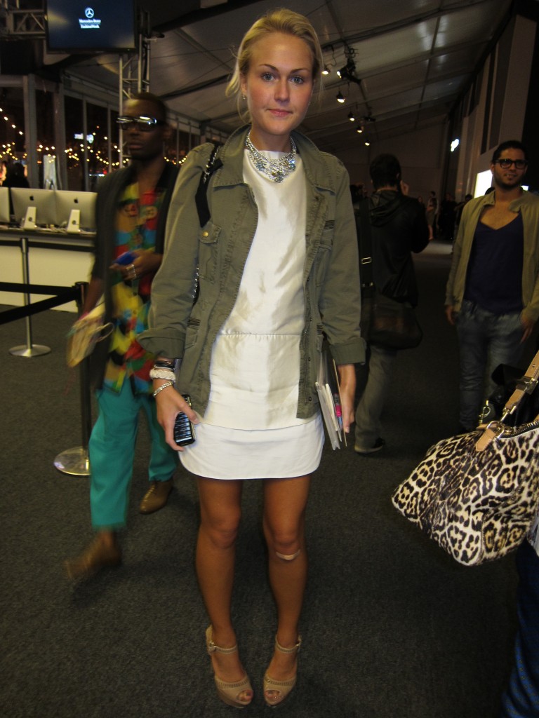 Since I’m on a roll with the blondes, I figured I’d make it the running theme of this FabCam post. This lovely blonde reminded me of me. She made a boo boo under her left knee! I wore a band-aid like this for weeks after falling in my heels. I blame the uneven concrete sidewalk. (should have sued lol) But ok back to the fashion. Do you not love the mix of rough and casual (i.e. the military jacket) next to the elegant silk sheath and sparkly necklace? Talk about casual cool.
Ok so who is your favorite?
If you were featured here, please leave a comment and tell us who you’re wearing and how much you paid for each item! Adoring fans want to know!
Click here if you’d like to win a goody bag from New York Fashion Week!

